Oceanside Library Celebrates Grand Re-Opening
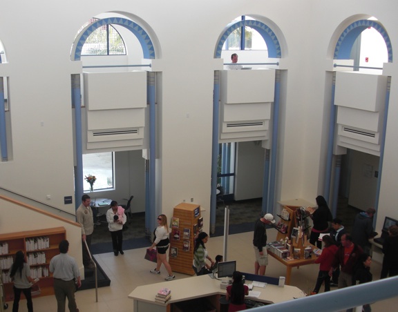
OCEANSIDE, Calif. (March 11, 2011) – Hundreds gathered recently for a grand re-opening of the Oceanside Public Library, where a new interior by domusstudio architecture showcases an airy, light-filled atrium and new consumer-friendly retail-oriented theme, all within strict budget constraints.
“This is the cutting edge of library design and it was accomplished within an incredible budget,” said Deborah Polich, library director, during the grand opening celebration March 2. “David Pfeifer and the team at domusstudio architecture embraced our vision, understood our budget constraints and respected the original work of architect Charles Moore from 20 years ago. They retained the light and added a freshness and originality that I think is amazing.”
Designed by San Diego’s domusstudio architecture, founded in 1986 as Dominy + Associates Architects, the interior remodel rejuvenates the two-story, 30,000-square-foot Oceanside Public Library with:
• new flooring and finishes;
• improved lighting;
• sustainable repurposing of existing library furnishings and used bookstore shelving.
Other than enlarging the main entrance, no exterior modifications are included in the $658,000 redesign.
The interior renovations put the library on the cutting edge of library design with a new marketplace service model, changing the way public libraries are organized and operate.
“We have a new service philosophy to encourage browsing,” Polich said, adding that library staff also is training to put more focus on people.
“Like the Gap and other retail stores, the library now showcases rotating displays of relevant and entertaining materials,” said David Pfeifer, AIA, principal at domusstudio architecture. “This new trend toward marketplace browsing manifests itself architecturally in tiered displays, table top exhibits and wall-mounted arrangements that showcase a variety of library curriculum. The library now has more hands-on types of displays, and more materials are displayed facing out instead of shelved on stacks.”


